Renovation Preview: Timeless and Inviting Rose Valley Home
So this type of post is a first for me… a peek into a project that is designed and in this case in construction but not complete just yet. We’ve recently started offering photorealistic renderings for our Full-Service Design Projects and although I don’t want to give the cart before the horse, but it’s too exciting and too good not to share.
If you follow along on Instagram or social media, you may have seen some snippets of the renderings as well as a few construction progress shots, but here I’m showing you more and sharing more of the background on the design.
There’s nothing I love more than working with families to transform a dated dwelling into the home of their dreams. The icing on the cake? Doing this and maintaining (and in this case adding to) the character of a classic style home.
Today, I’m excited to introduce you our latest project in progress — a 1960s Colonial. As you might know, colonial homes are found all over the East Coast. They’re typically characterized by their symmetrical appearance, with a central hallway, bedrooms upstairs, and walls, walls, and more walls!
Meet the Original Rose Valley Home
Nestled in Rose Valley, this particular home wasn’t too old compared to many of the historical homes in PA, but it was certainly dated, cave-like, crowded, and lacked storage. When they first reached out to me they called it “Project No Walls”. They purchased the house with the intention of opening it up and making it work better for their family and helping them enjoy an indoor/outdoor lifestyle. The home also fell short on the architectural details our clients craved for an upscale, classic feel. Here’s how it started:
Even though the home had ample square footage, daily living for this family of four felt tight. They wanted an open, airy feel with more light, a space to connect, and room to move about effortlessly. Opening up the dining room, kitchen, and sitting room into one big space and opening up the living space were both top priorities.
Next on the hit list was reorganizing the areas near the garage entrance. This included their mudroom/laundry room and powder bathroom as well as another bathroom off the office. With 4 cramped spaces all smooshed together, with mishmashed styles, and a lack of necessary storage, it was essential to give these areas a new purpose.
They also have a gorgeous pool and backyard area (not pictured), so it was essential to include a plan for indoor living to flow seamlessly to the outdoors. With a dark, disconnected back porch, we made a plan to add lots of windows and reconfigure the patio for functionality.
Creating the Floor Plan
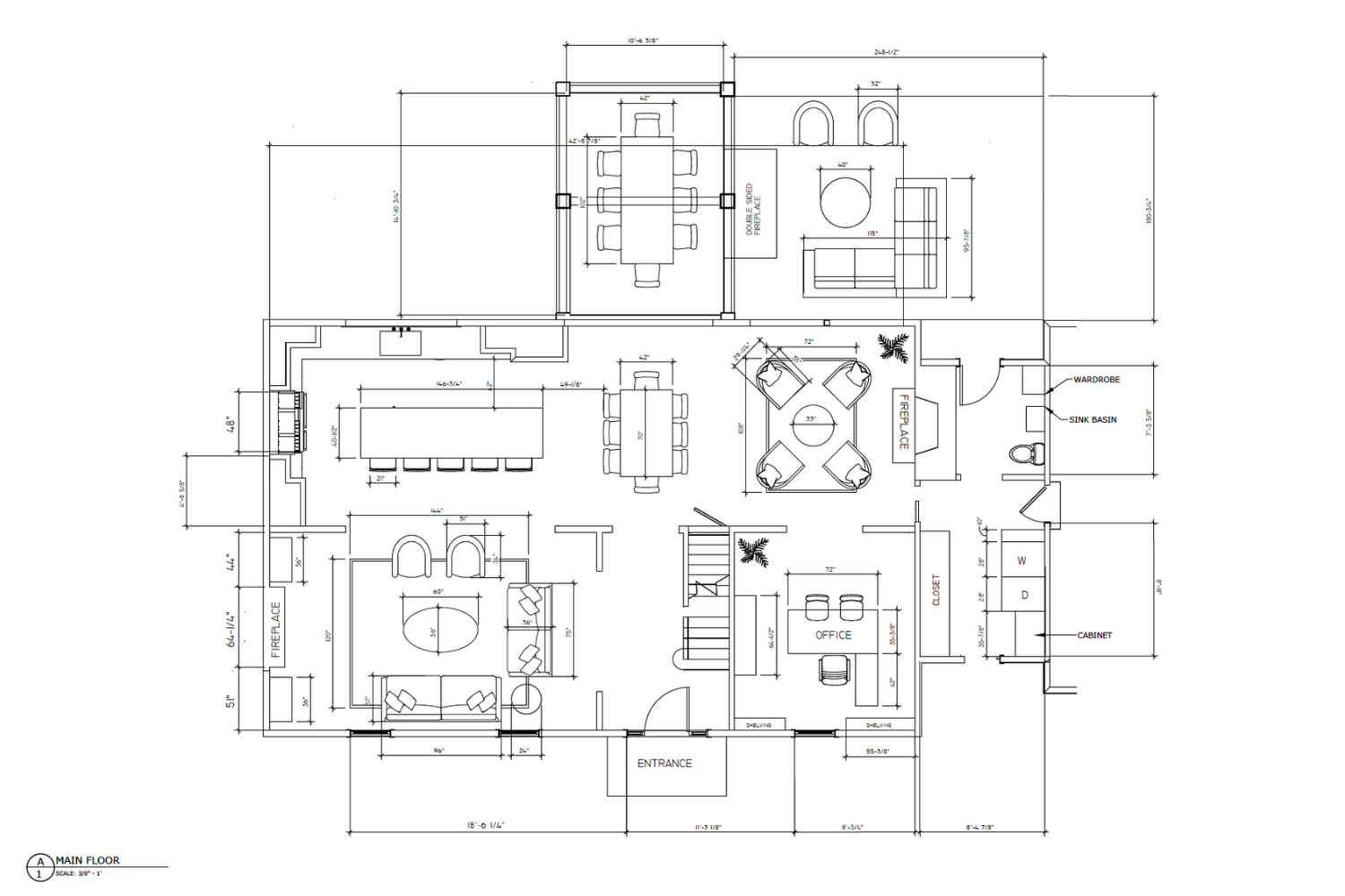
With any home renovation, we always (always!) start with a plan first. First we worked with an Architect to get the general project layout and scope as well as the technical construction drawings drawn up. When that was complete, we began creating our plans. Using each room’s function as a roadmap, we plan out the spaces, defining exactly where each piece of furniture will go. We do this long before construction since the layout of each room directly impacts the structure of the home. Here’s the final floor plan:
We created a cozy, open concept space on the first floor, perfect for family living and entertaining (and removing some of the Colonial-style walls). In addition, the kitchen more than doubled in size compared to the original space. The end result? A functional and inviting home that flows beautifully and will stand the test of time. Exactly what our clients desired.
So…are you ready to see the design?
3D Renderings: Bright & Airy Kitchen Design
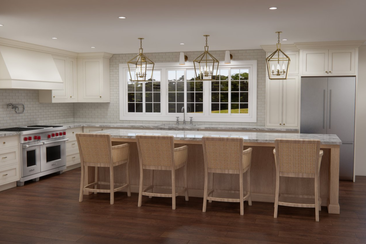
We don’t create 3D renderings for all of our projects, but we find them extremely helpful for full-home renovations, where our clients want that extra layer of confidence in the finished result. For their kitchen, we created this classic, updated, and fresh design…
Clean lines. Modernized elements. Airy design. And materials selected with longevity in mind. The ingredients of a beautiful kitchen. While a wall of windows adds abundant natural light (and great views while doing the dishes), a mixture of white materials, texture, natural and reflective stone countertops, and classic lighting will work together to brighten the space.
Remember the old kitchen with a closed-off L-shaped island that contributed to many traffic jams? We worked our magic, and…voila. Now, this will become a perfect open space for family bonding, mingling, and gathering with friends.
Classic & Welcoming Living Room Design
We were inspired by the neutral, classic materials you see in more historic homes. However, we will pair them with some contemporary elements to play with a mix of modern and traditional styles. The end result? A reconfigured room with a warm and inviting sitting area. It will be spacious, sleek, and clean, and flow right into the kitchen.
Coordinated Laundry, Mudroom, and Powder Room Design
The old space where the laundry room and the two bathrooms were crowded was crying out for storage. To amp up the details, we selected a stand-out wall color, beautiful natural stone countertops, and tons of cabinetry that will extend to the ceiling to maximize space.
Behind the pocket door, we are reconfiguring the powder room to double as the pool bathroom, using the family’s backyard as the inspiration. With a pop of blue tile (similar to what is used in the pool area) and bright white trim that ties in with the adjoining mudroom and laundry space, the room will feel like an effortless extension of the outdoors.
Spa-Inspired Primary Bathroom Design
Ahhh… these are the dreams bathrooms are made of. This room had no shortage of walls either. It was small and not functional. With our new floorplan, we will be able to create a sophisticated, large, and luxurious master bath. The room features a mix of natural marble, white cabinetry, a modern glass shower, and a huge soaking tub. Previously, this was a narrow, non-functional space and now, it ties in seamlessly with the rest of the remodel. We loovvve the relaxing vibe in this master bathroom.
What’s Next?
As I’m writing this, construction is well underway for our clients in Rose Valley. We can’t wait to show you alllll the deets in the final reveal fall 2022!
UPDATE! Our Main Line Classic Modern is complete and you can see the reveal here
If you are considering a remodel to breathe new life into your dated home, we would love to help. Reach out here, and let’s chat about your goals.
Until then,
Libby


