Bent Road Kitchen
This project has been quietly lurking in our portfolio for a couple of weeks, without much fanfare. Sharing the inspo, design process and the before and afters is our favorite post-project things to do. So, with no further ado…here goes everything about our Bent Road Kitchen!
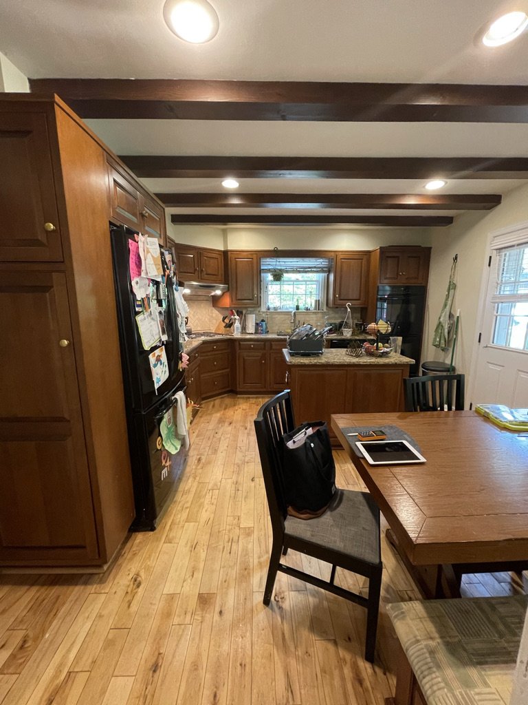
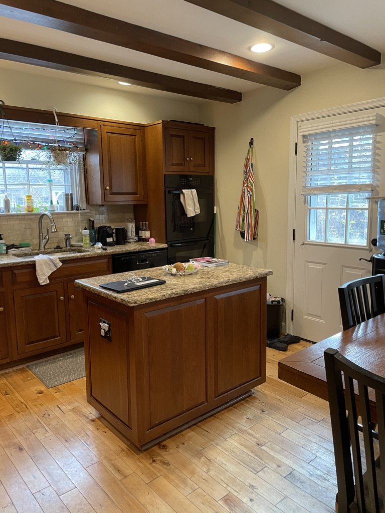
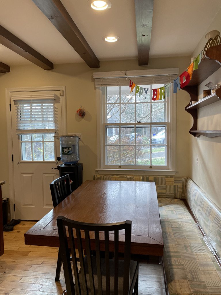
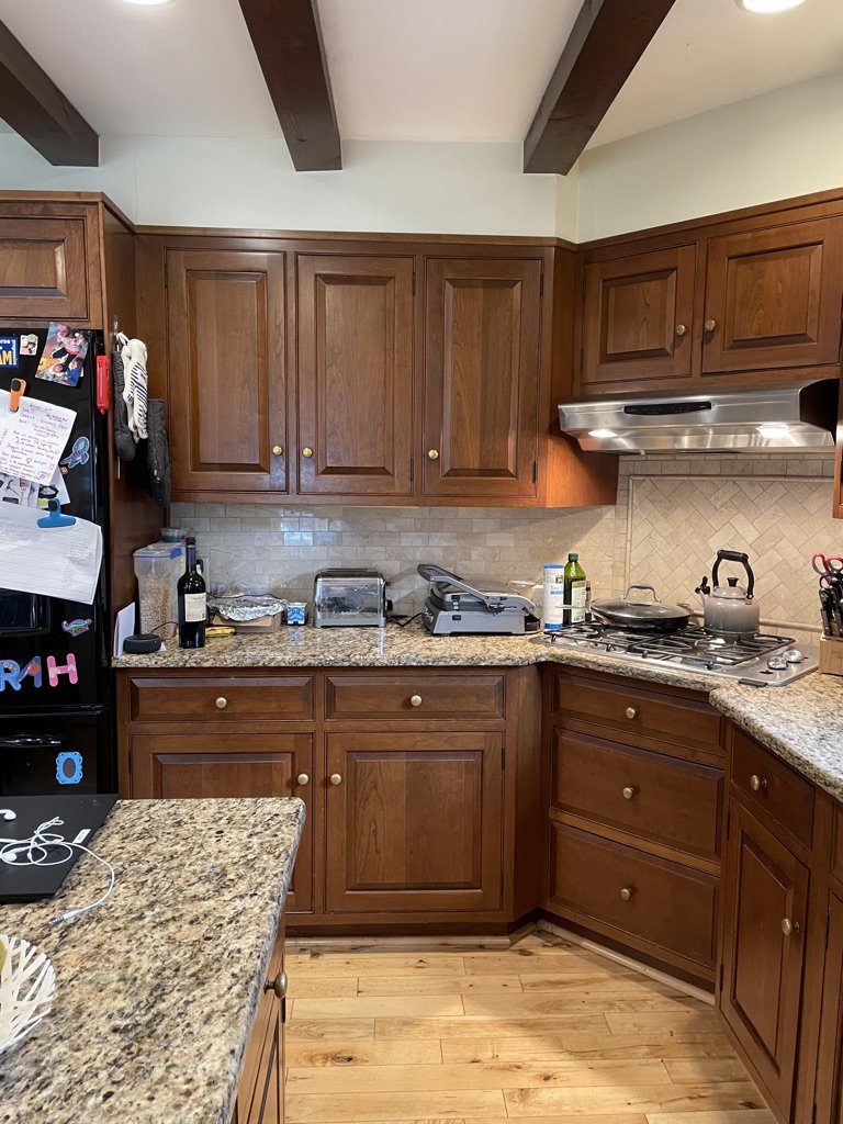
Before
Our clients hired us to remodel their outdated 90’s kitchen in Wyncote, PA. The space wasn’t large, had an awkward corner range and a tiny dated banquette, and generally was beginning to show its age.
Once we saw it we knew what we wanted to give our client - beyond style. Our goal was to create a more functional space with indestructible elements and smart storage - just what a family of 5 needs!
Inspiration
We pulled inspiration from many places. First, the client's love of green and their cool industrial modern style paired with clean lines and industrial materials.
While embracing the cool and modern, we still wanted to keep their space feeling warm, comfortable, and welcoming. Natural wood and touches of brass throughout the home brought in just the right amount of warmth and contrast. Timeless is one of our favorite things to do, so we designed it with our client’s personality and daily lifestyle in mind throughout the design process.
After
Tada! The after is such a beautiful transformation with fresh simple materials and a really cool play on the light and dark. I especially love how the small shelves turned out next to the windows. If you look closely, the gentle curve on the edges added just a little something and turned out to be one of my favorite little details. Pairing the simple countersplash with the cool touches of green with modern lighting that ties in with the banquette and the bar down the hall.
In any project, functionality comes first. And to give them the functionality and flow they craved, we expanded the kitchen slightly into the dining room to allow for a bit more space. We enlarged the island. This island has a ton of storage, but no seating, so we and added a beautiful custom banquette (more on that to come).
Although the clients love green, they didn’t want the design to feel heavy-handed with color. So the kitchen design focused on simplicity. Grounded by dark tile floors mixed with a lighter, natural wood for the cabinetry the space feels moody and bright at the same time. Paired with custom designed simple hood and striking quartz counter splash the space feels textural and crisp with a depth and nuance to allow the simple details to shine - such as the simple curve of the shelves above the sink.
We opted out of island lighting in favor of 3 green ceramic semi-flush mounts above the sink and a statement brass pendant over the industrial-style dining table, giving the room just enough visual interest with a couple of bold choices. A common thread of brass pairs beautifully with the green in all the spaces, and ties everything together. We mixed in some matte black in the hardware in the kitchen as well as a touch of nickel in the faucet for depth.
Another favorite part of the project is this showstopper custom banquette. This was a labor of love and something that I wanted to create for the client that really allowed their family to enjoy special meals together. Whether it’s rushing off to school in the morning, or enjoying a family meal at the end of the day, we wanted it to be comfortable and easy to clean. We used a mix of Crypton velvet, in the project’s signature color green paired with chestnut leather for easy wipe-ability. The piece was custom-built to fit exactly in the space and even wraps around the widow sill to maximize seating space and to grow with the family.
We kept the mood flowing into the hall around the corner in this bar area where the green is amplified with glossy, green subway tiles paired with green cabinetry for a tone-on-tone look. We brought in some rich gold touches with the light fixtures in both the bar and kitchen and added touches of natural materials to tie in with the kitchen and bring warmth.
Last, but not least, a tiny powder room with a fun botanical wallpaper giving off all of the drama feels. We painted the wainscoting a green-black to add to the original charm of the home, with a fresh take and pairing perfectly with the bold wallpaper. A modern light fixture keeps the industrial mood flowing throughout the house.
And that’s a wrap on our Bent Road Kitchen, Bar and Bathroom Remodel!
We were so excited for the opportunity to have this project featured on both Haven. and Real Simple’s Space of the Week.
If you’re ready for an update or full remodel, Reach out for a discovery call to find out more about our Full Service Design!
Until next time! Libby


