
Philly Foursquare Kitchen Remodel
Designing for clients is one thing, but designing my own kitchen in my 1920 American Foursquare home? That’s a whole different kind of challenge! When we moved in back in 2011, our all-American kitchen was stuck in the ‘90s, complete with black granite countertops, orange-toned wood, and tile floors that were just bad. Over the years, we made small updates to freshen it up like painting the cabinetry white, adding a backsplash tile and getting new fixtures and hardware. We knew that a full renovation was on the horizon. And let’s be real kitchens are big investments so we had to wait until the time was right. There is no shortage of challenges in this space, and after designing dozens of kitchens, large and small—this was the hardest one I’ve done.. Two awkwardly connected spaces, a fireplace, and a stairwell to navigate made it difficult and costly to expand. It took a lot of planning (and a little bit of agonizing) to figure out how to make the. most of a small space and to get it just right. Now that it’s finally complete, I’m so excited to take you behind the scenes—sharing the before-and-afters, design decisions, and all the little details that make this space home.
The “Before” & a Trip Back to the 90’s


“Almost After” | Renovation Part One
By 2017, we knew we needed a better solution to hold us over until a full renovation. We added a larger island for more prep space, additional ikea cabinetry in the back, and updated the floors to bring the hardwood through, which instantly warmed up the space. It was much better; however, it always felt slapped together, and the awkward layout remained. Expanding wasn't a feasible option for our budget with structural constraints like the fireplace and stairwell. Instead, we focused on making the most of what we had. I also have to admit, when we moved in and started changing things, I made a super hasty, quick decision on the backsplash tile and never really loved it. But I always say mistakes are great teachers, and I’ve learned through this process in my own home, that when designing any space (especially for clients) step-by-step and thoughtful always makes for better design. So no more hasty decisions for me! I now embrace the process and make decisions based on the final goal… not instant gratification.


Inspiration | English Cottage, Timeless Details and Modern Functionality
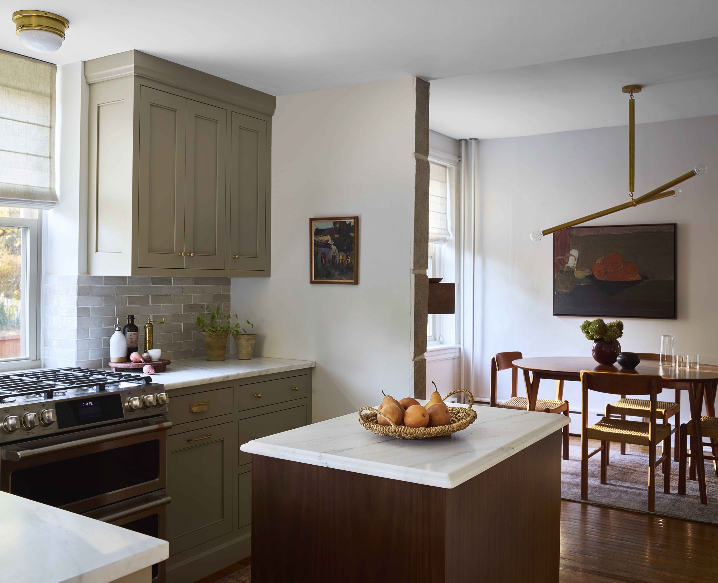
Living in an old house is one of my favorite things and I truly believe that spaces such as kitchens and baths, should speak to the home they reside in. I love classic details mixed with modern elements and love English Cabinetry with simple elevated shaker-style design with added moldings and elements that create a bespoke and soulful space. As with all of our designs, I wanted that refined but approachable style with thoughtful details that made the space shine.
But here’s the twist… It’s a little so much harder to make decisions for my own home than when I make them for clients. One example was choosing the right cabinetry color. I honestly agoonnniiiiiized over this decision. I wanted a warm neutral with brown and green undertones that wasn’t too dark or too light. I tested what felt like every paint color imaginable and in the end, I circled back to one of my favorite colors, Farrow & Ball Light Gray, and the color we used in our bathroom renovation a few years back. And I couldn’t be happier with the decision. While part of me felt like, because I’m a designer, I should have chosen something different or been more creative in my color selection, I ultimately silenced my inner critic, and trusted what I loved, and the result is a space that feels timeless and inviting.
The “After After” | Renovation Part Two
When it finally came time for a full renovation, our goal was to create a highly functional kitchen that embraced the charm of an English cottage while incorporating modern conveniences. Custom cabinetry became the heart of our design, allowing us to maximize storage and improve the flow of the space. The biggest change was moving the refrigerator from the front, just 10” from he range to the right, and putting it in the back. This transformed the area into a scullery with a pantry, coffee bar and additional storage—made possible by closing a window and adding full-height cabinetry.
One of the biggest upgrades in our kitchen was the choice of materials, each selected to enhance both beauty and function. I knew from the start I wanted marble. I know that marble gets a bit of a bad rap because of upkeep, but I don't think there's anything else that compares to the beauty of marble. I am ok with the patina and actually love how it changes and ages. I wanted Calacatta marble, but it unfortunately wasn’t in the budget. So as I was looking for a Cararra slab, I came across the most beautiful Danby marble. It has the soft, warm color of Calacatta, but with wispy, beautiful veining. Not only is it gorgeous, but it is less porous and, unlike Italian marble, is less likely to stain. It does etch if it comes in contact with lemon or vinegar, but also, unlike Italian marble, etches can often be buffed out with Comet.
Working with a custom cabinet maker allowed me to customize every detail, including my cabinetry style. I went with a simple shaker with a small bead only at the top and bottom. I opted for all slab drawers and a simple crown molding profile. You also may notice I elected not to have any toe kicks. I wanted that built in English cupboard feel, and I hate all the crumbs that get caught in a toe kick.

The sink area posed a bit of a spatial challenge. There is only a small space to add a sink, so I sourced the largest undermount fireclay sink I could and finished it off with a stone apron. I love this look, and felt that a farmhouse sink would have been too bulky. It also allowed me to get a deeper sink, and in a small kitchen, even that small rim of countertop in front of the sink is useful. To the right, there was an awkward little nook of space that wasn’t being used, so I got creative and installed a hinged-door cabinet to store cutting boards and baking sheets—one of those small, thoughtful details that make daily life so much easier.
For the backsplash, I couldn’t resist Moroccan Zellige tile. Its handcrafted quality, subtle color variations, and texture add so much depth and character to the space, giving it a timeless charm. I love the way that it reflects light and brings in a subtle sheen along with a slightly different tone to create that clean and textural look.
And you may think that art in the kitchen is not practical, but when I’m cooking, I just slide my iPad right on top of that artwork on the easel next to the kitchen and it acts as a cookbook stand!


The island is another favorite element, crafted from my walnut and is my very favorite wood species. It brings so much depth and warmth to the space. The design mirrors the design of our bathroom vanity with the slab drawers and simple feet. ot only does it bring warmth and prep space to the kitchen, but it also features a built-in trash pull-out—game-changing for quick cleanup while prepping meals. I chose an ogee edge for a little extra elegance, and since the space is on the smaller side, we kept the lighting simple, opting for understated fixtures above the range and sink to maintain a clean, cohesive look, and choosing to forgo a pendant over the island.
And although you may not see them in these photos, because well…. photoshop, we do have recessed lighting (shhhhh don’t tell!) so the space feels bright when I need it as a workspace. And another upgrade that you won’t see in these photos, and one of my favorite additions was integrating Sonos speakers into the ceiling. There’s something about cooking with music playing in the background that makes the whole experience even better.
Using unlacquered brass was also something that I knew I wanted early on. The brass faucet might just be my favorite detail, as it develops a rich patina over time, adding to the character of the space. I also added a mix of different unlaquered brass hardware, and I can’t wait to see how it ages and patinas as time goes.
We upgraded to a Café double oven range, which has been an absolute dream to cook with, while keeping our existing dishwasher since it’s still in great working condition—though when the time comes, we’ll swap it for a panel-ready model. To keep some continuity (and save a little money) we stuck with the same window treatments in the front part of the kitchen, ensuring everything still feels connected. Every detail was carefully considered, and now the kitchen feels like the perfect blend of function, charm, and timeless design.
The Scullery
Our new scullery is more than just storage—it includes an integrated refrigerator, full pantry and coffee bar with a pull-out shelf, making it easy to refill the water reservoir without hassle. This small feature has made our mornings so much smoother! On the other side, there is additional prep and storage space with glass cabinetry (all with integrated lighting) to store glassware and serving pieces, a beverage fridge, and additional storage. This small space packs a big punch, and adding additional storage and usable prep space in a small kitchen has been a legit game-changer.

Breakfast Nook
In the breakfast nook, we have this big stone fireplace (which made it very difficult to expand the kitchen) and a small eating area. We use this space every day and is where you can find the kids doing homework, eating breakfast, and family meals here at night. It’s great that within steps of the kitchen and can be used as an extension of the space. In this little room, I wanted to introduce some modern contrast to the home’s architecture and the classic elements of the kitchen. I love the mix of modern lighting with vintage mid-century dining chairs—a juxtaposition that keeps the space feeling fresh yet timeless.


A Heartfelt Thank You
Thank you for touring a space really close to my heart! Designing my own home was an incredible journey—one filled with inspiration, challenges, and ultimately, so much joy. Seeing the transformation from before to after has made every decision and detail even more meaningful.
If you’re interested in remodeling or designing your dream kitchen, Contact Us Here.
Talk soon!
Libby
Real Life. Well Designed.
Sharp & Grey Interiors is a full-service interior design studio specializing in creating beautiful yet highly livable spaces that feel as curated to how our clients live, as they are to their personal tastes and style. Sharp & Grey offers a wide variety of flexible design options, from full-service interior design where we do it all, to consultations and custom E-design services that give you the ideas or design plans to install your design project yourself. With a focus on creativity and collaboration, Sharp + Grey Interiors can help you create a home you love with fresh and inspired designs made for real life.