Main Bathroom One Room Challenge Week 1
Hello! First of all, if you’re new here WELCOME! I’m Libby, an Interior Designer based in Philadelphia and specialize in beautiful design made for real life. Originally from Denver, I add my west coast aesthetic to historic and classic East Coast homes
This post is part of an 8 week series for the One Room Challenge, where designers and bloggers from all over makeover one space in their home from start to finish. I’m tackling our main bathroom renovation. Thanks for following along, I can’t wait to show you what I have in store. Check back here every Thursday for updates!
About the Challenge
This is my first time participating in the One Room Challenge as a guest participant, and I’m cool, calm, and collected (and not at all nervous). I have been so inspired following along on previous challenges and always dreamed of joining and showing the progress on a design project from the very start to the finish. And today is the day, I’m so excited to get started!
This is week one of the Fall One Room Challenge. This exciting bi-annual event showcases twenty designers and bloggers designing rooms over the next 8 weeks along with guest participants - like me. It will be packed with inspiration, sources, DIY projects, and the very best before and afters! Make sure to check out all the other spaces and follow along with all the other amazing projects.
About the Project
Let me first start by sharing that we live in a 101-year-old house. I love so many things about this house, it’s packed with charm, architectural details, high ceilings, amazing baseboards, and trim work original stained glass, and tons of natural light and lovely creaky original wood floors. The one thing that it is not packed with is modern conveniences like large en-suite primary bathrooms and big kitchens (I will get to that project later). You can see more of the house here.
It’s 3 stories, has 5 bedrooms 2.5 baths. This means that there is ONE bathroom on the main bedroom floor where everyone sleeps. When we bought the house my oldest daughter was 2 years old, so sharing didn’t seem too had. When we saw the house for the first time I was more enchanted by the wrapping staircase backed by stained glass, where I immediately imagined my kids growing up and coming down those stairs every morning in their cute little pj’s. But now my daughter is almost 12 and my son is 7 and we are all sharing this ONE bathroom.
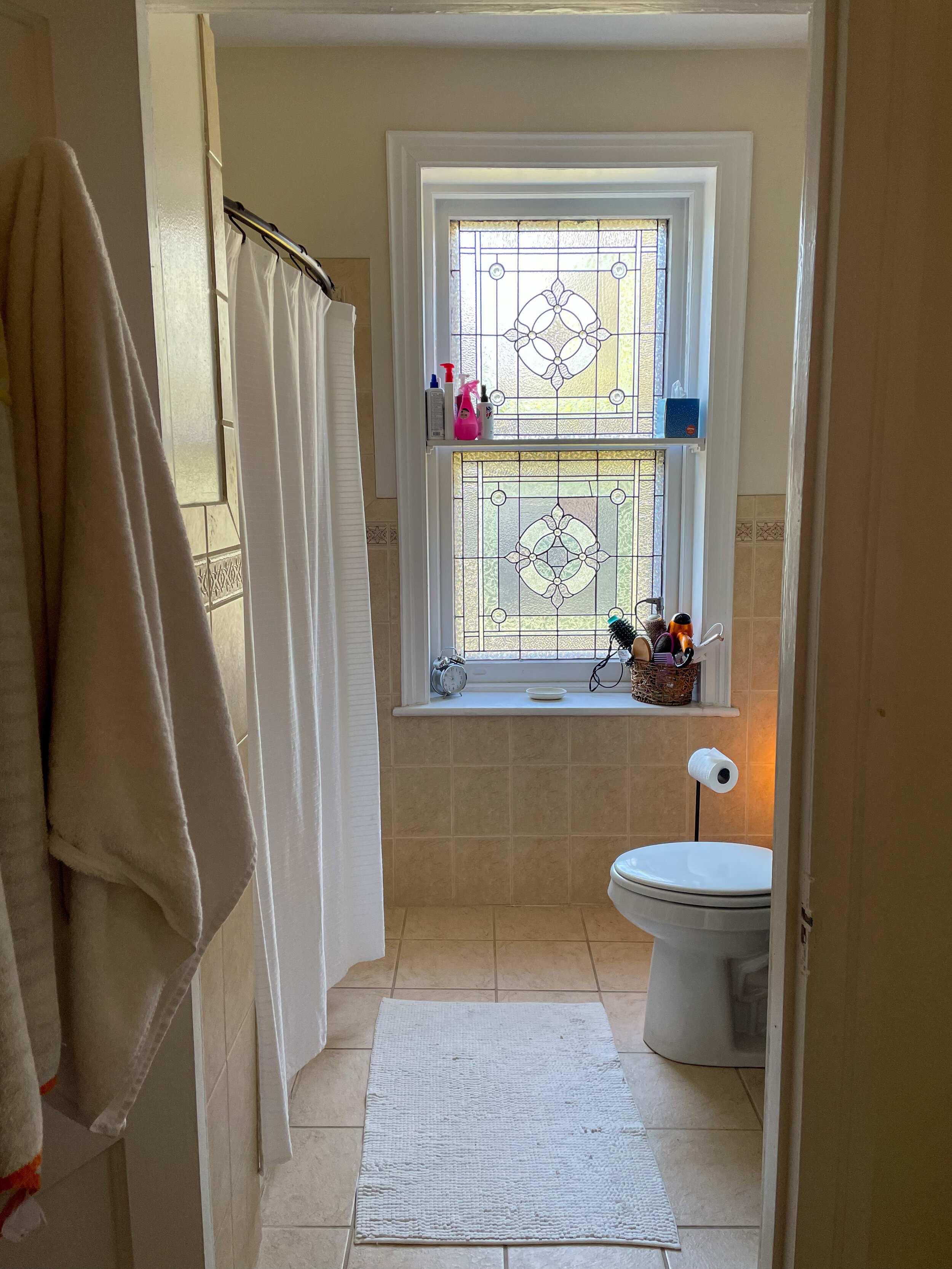
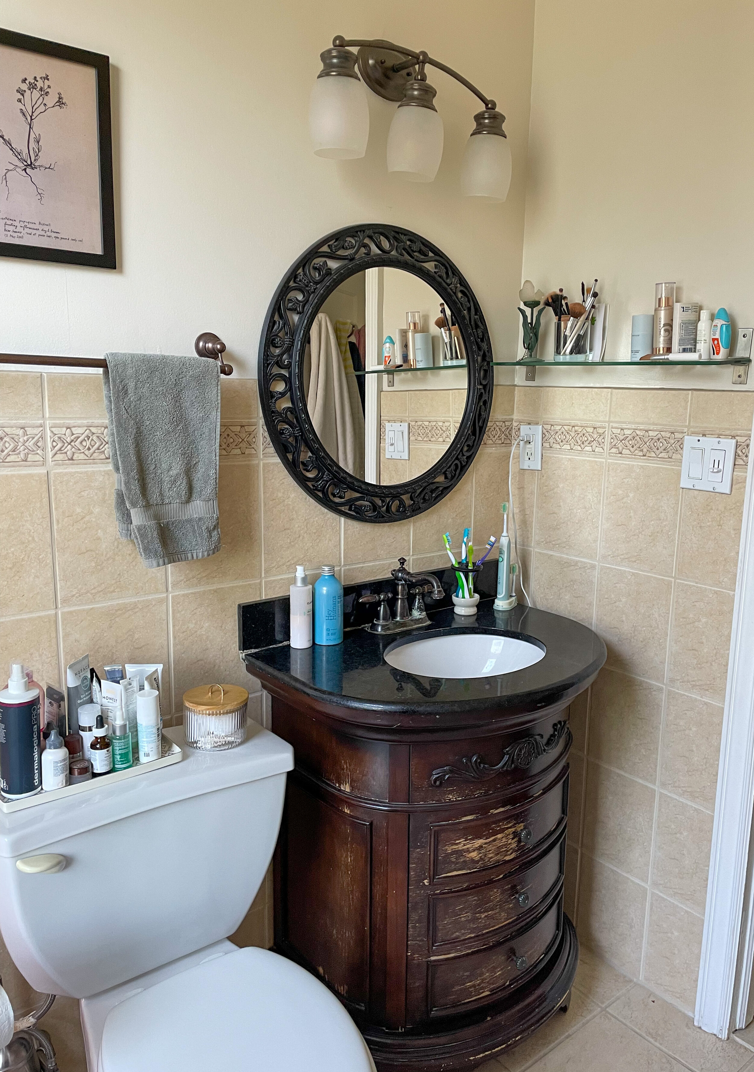
Let’s just stay it gets crowded. The previous owner did remodel it sometime in the ’90s, so although it’s not original or gross, it’s circa 1995 Tuscan Home Depot special. So… not our style at all.
Before
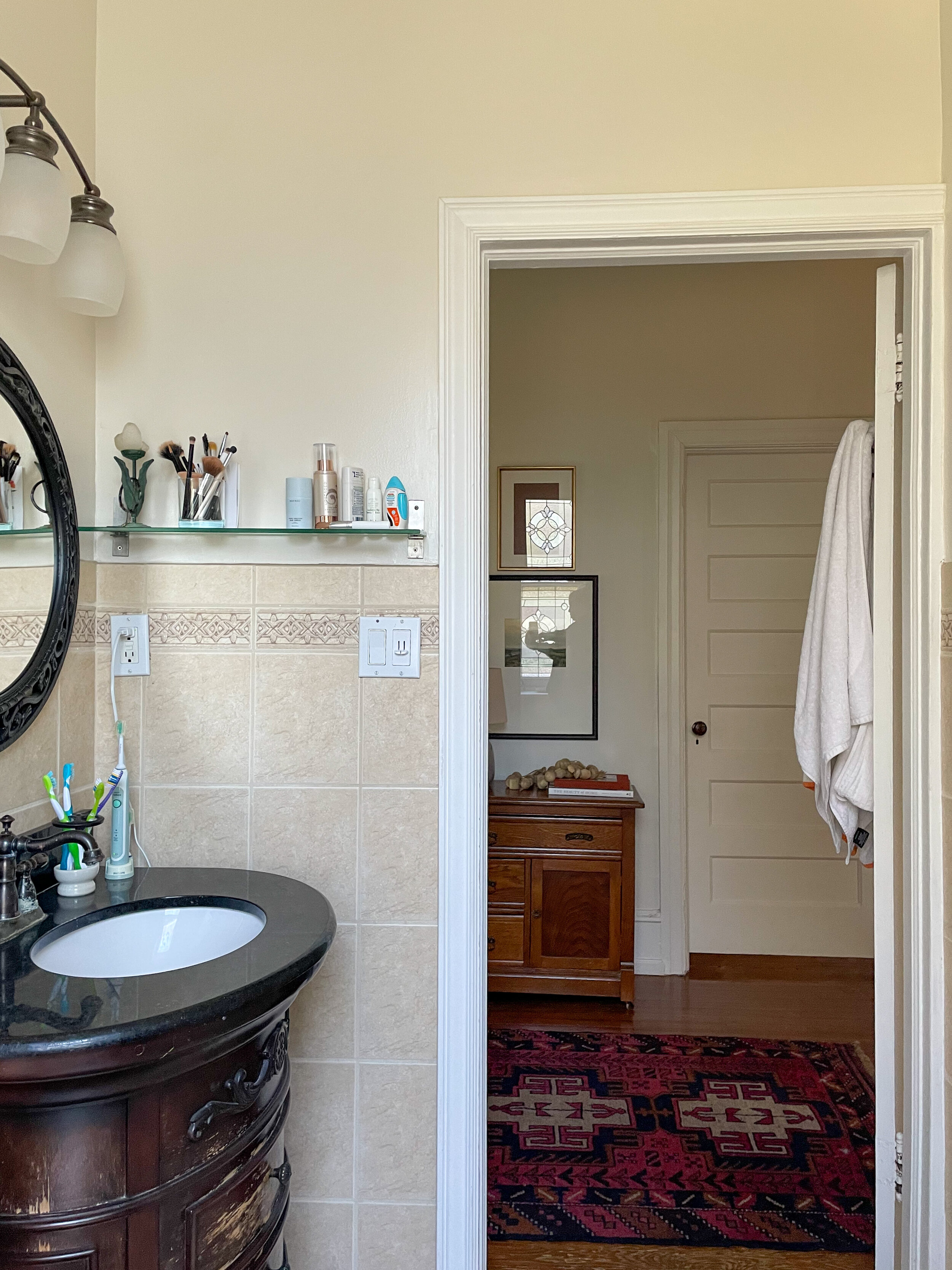
And here comes the truly embarrassing part. Here she is, in all of her pink beige tile glory. As you can see had zero storage, so there is “stuff” just anywhere and everywhere I can find a spot. On trays and shelves… basically, any flat surface has “stuff” on it.
Now, I don’t know about you, but clutter and “stuff” drives me absolutely crazy. I feel stressed and overwhelmed every time I go in here and it’s about as far from serene as one place can get. You can see in the hallway that I have extra storage there and there is one small linen closet in the hall. I dream of pretty little storage cubbies and drawers neatly organized and tucked out of sight
Also, the counter space is also basically nonexistent, and I haaaate the tile, the toilet always gets clogged and the plumbing is starting to leak. I do, however, LOVE the stained glass window. But with everything, the way it is it gets lost. So I think it’s fair to say that it’s time for a refresh and give that window its moment in the spotlight.
Project Inspiration
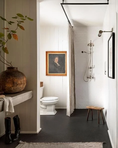
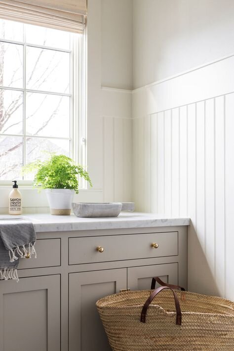
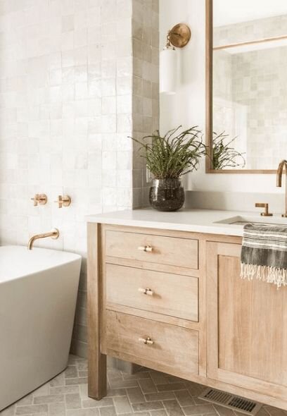
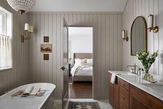
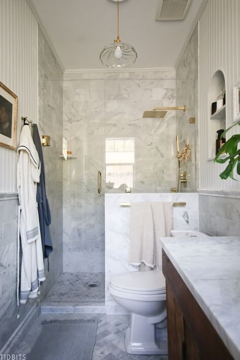
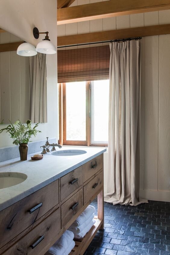
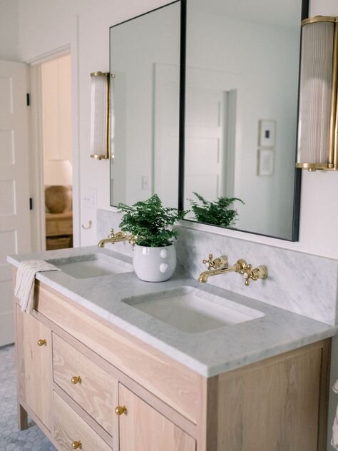
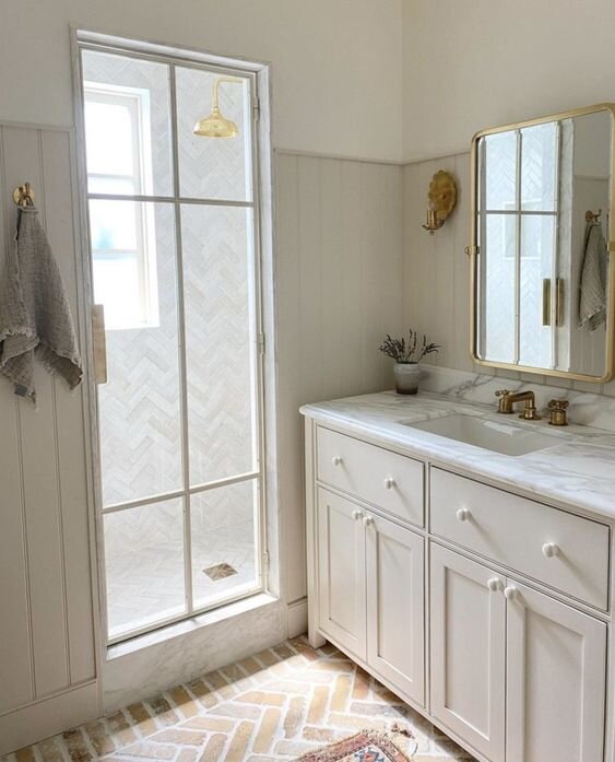
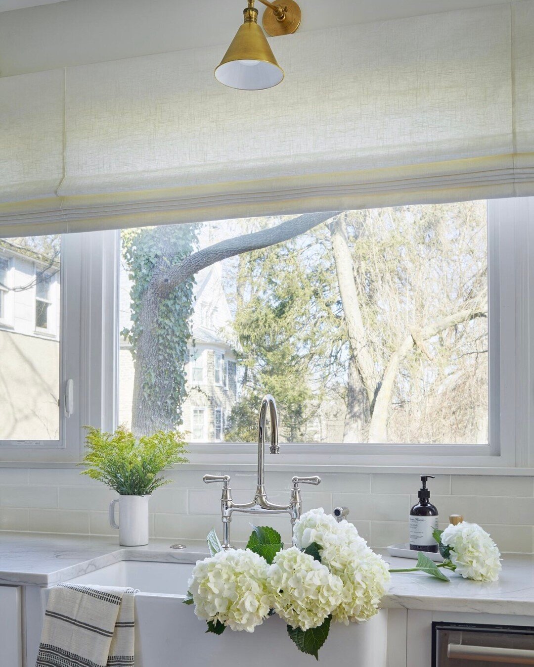
Let’s talk about how she’s going to look after. There is so much beautiful work out there for inspiration and these images from amazing designers, represent the mood that I’m going for in the bathroom. I want it to be filled with textural elements, classic finishes, warmth and soul and feel like a warm hug - serene and comfortable.
Mood Board
All design projects start with a Mood Board. This is a visual representation of the look and feel for the project and some initial selections. If I could sum this design up in one word it would be TEXTURE. I personally love neutrals and tend to gravitate towards texture far more than I do color. I work with many clients that want to incorporate color into their homes and I do a lot of designs to bring them that color. But this one… I really wanted to play with texture and lean into that tone-on-tone look. I want the space to feel fresh, serene, modern, all while feeling right at home in our 101-year-old four square.
My main priority when designing any space (especially a kitchen or bath) is to work WITH the architecture first. In older homes, I like to use classic materials in interesting ways so that the room first feels at home in the house, but also feels current and modern. The juxtaposition between the old and the new, the mix of styles and the play with materials creates amazing results excites me every.single.time!
The house has some original marble and we’ve brought it through in other spaces as well, like our powder room and our hearth. It’s a classic material that will never go out of style, so it needed to make an appearance here, but this time it’s going in a herringbone pattern.
There will be lots of warmth and contrast with brass plumbing, hardware and lighting. Many times I mix metals in Kitchen and baths, but this time brass is going to be the star of the show. And as always I try to play with styles to add things that feel fresh and modern all while staying timeless and classic. Artwork and styling will bring in additional warmth and soul and I have few fun detail ideas up my sleeve. You will have to stay tuned to get all the goodness.
Coming up Next…
Over the coming weeks, I will share the progress and more about the design and the process. Next week is demo and I will be sharing the full design board along with some floorplan changes we are going to make after a surprise discovery last summer. Can’t wait for you to tune in for the next installment.
Don’t forget to follow along on Instagram, Facebook and Pinterest and check out the rest of the ORC participants as they redesign their spaces.
Real Life. Well Designed.
Sharp + Grey Interiors is a full-service interior design studio specializing in creating beautiful yet highly livable spaces that feel as curated to how our clients live, as they are to their personal tastes and style. Sharp + Grey offers a wide variety of flexible design options, from full-service interior design where we do it all, to consultations and custom E-design services that give you the ideas or design plans to install your design project yourself. With a focus on creativity and collaboration, Sharp + Grey Interiors can help you create a home you love with fresh and inspired design made for real life.


