Classic Colonial Kitchen Remodel
See our latest project reveal. A classic colonial gets an expanded kitchen with charming classic English details.
This kitchen, and laundry design is in the historic neighborhood of Elkins Park PA, just outside of Philadelphia. This 1925 home is packed with charm and character but also had a characteristically small kitchen from the time period.
Our clients hired us to expand the space all while preserving the stylistic details of their historic home. See how we took this cramped, and compartmentalized space and turned it into a perfect family kitchen filled with character.
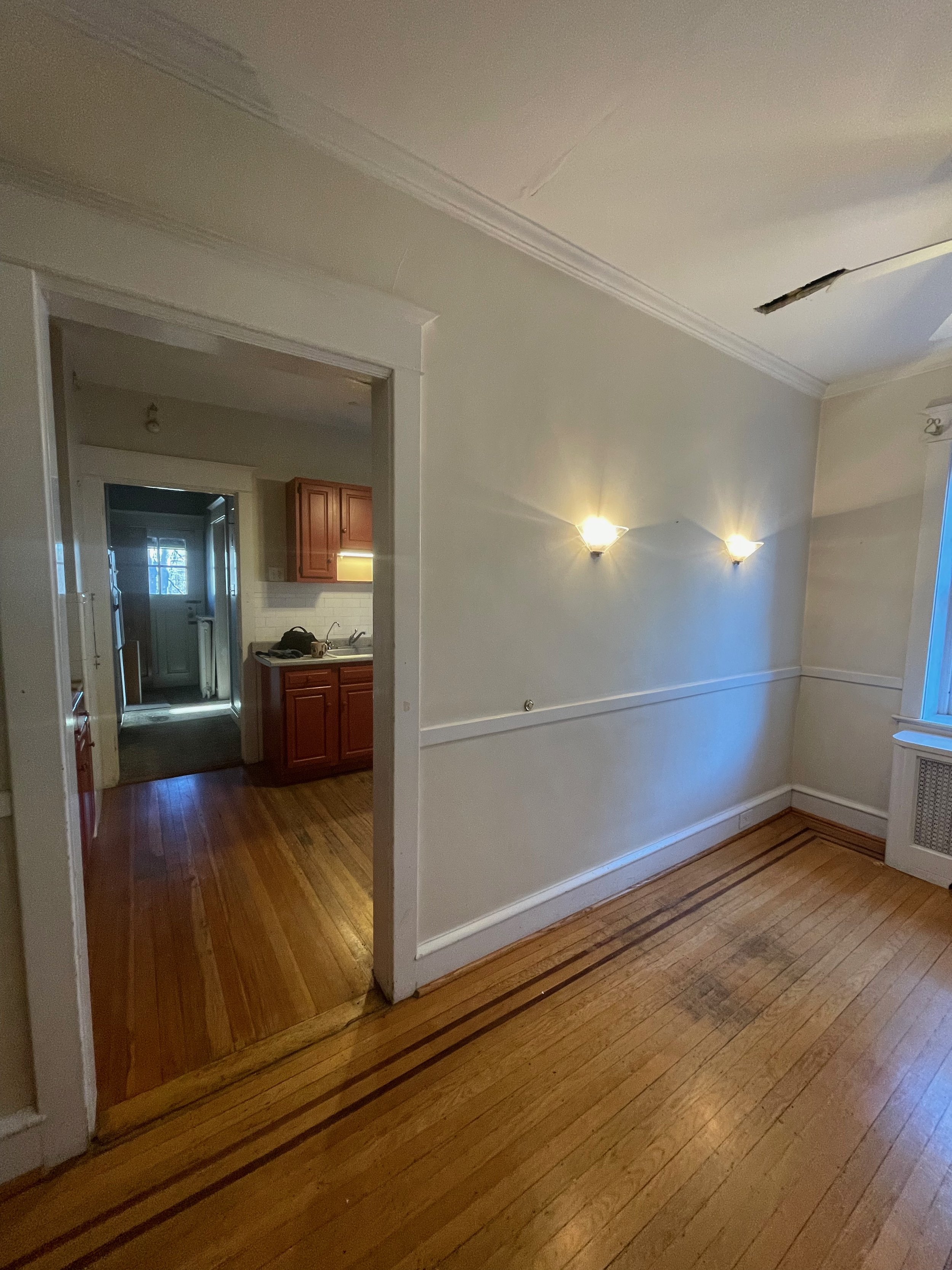
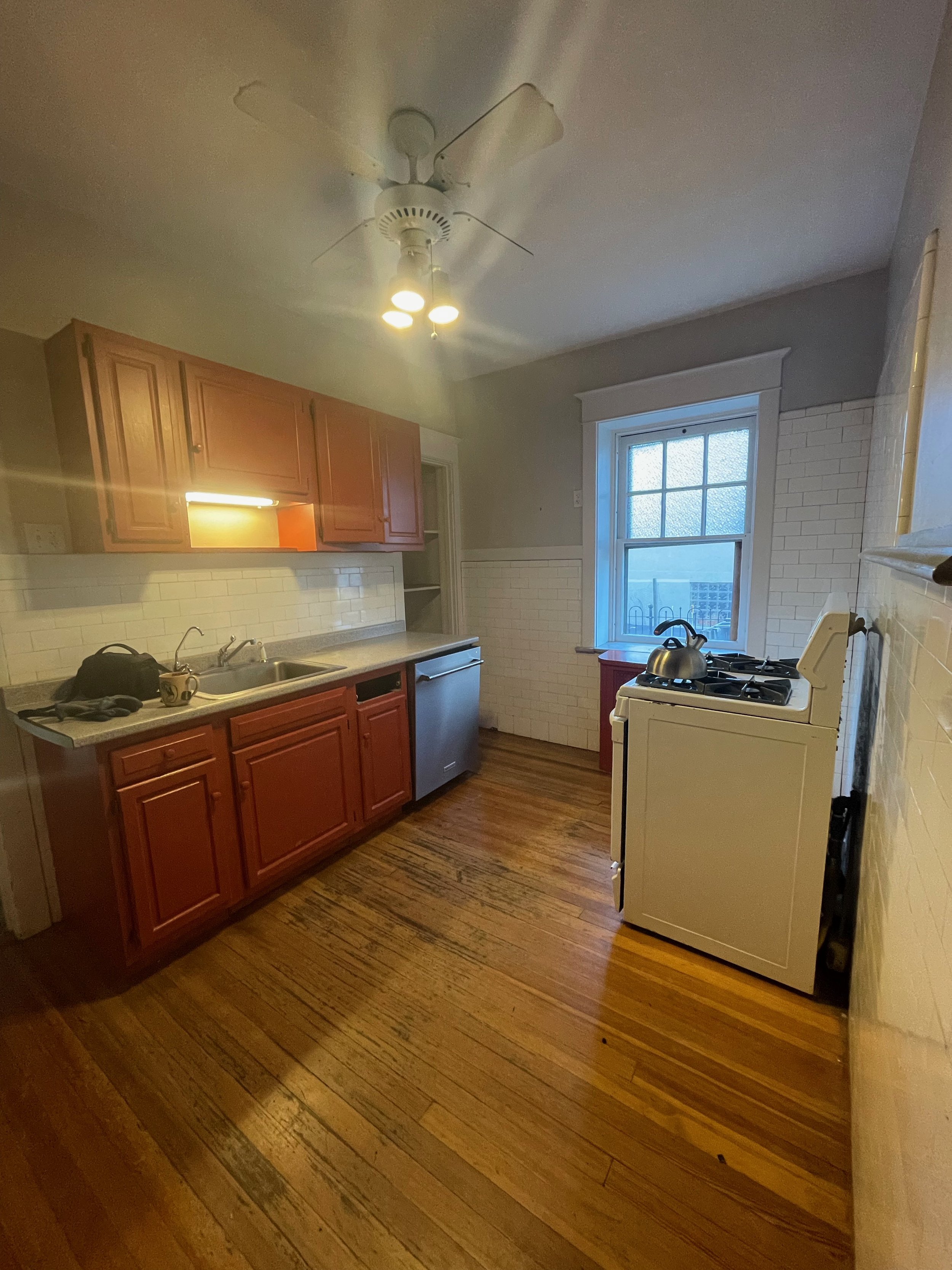
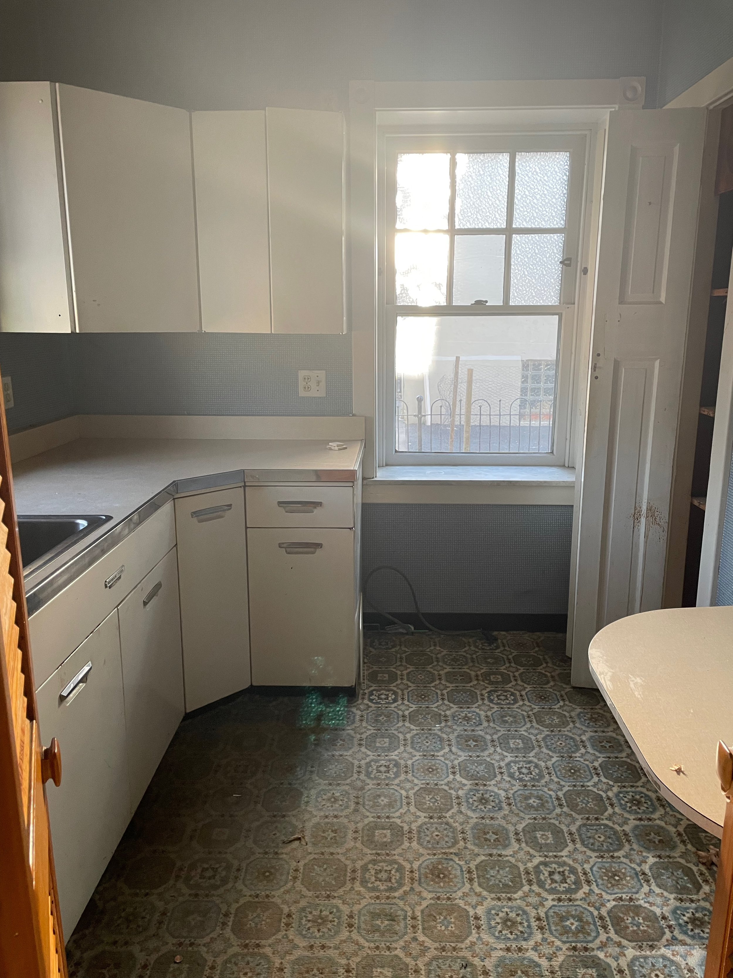
Before
The original kitchen was small and the layout lacked flow and functionality. Our clients enjoy cooking and spending time together, but the kitchen layout didn’t allow for more than one person in the kitchen at a time. So we stepped in for a full kitchen renovation to give the family a space they could all live (and cook). We expanded the space by removing a wall between the original kitchen and a tiny dining space to create an open-plan layout. We created functional and thoughtful storage throughout the kitchen by removing oddly placed closets.
Inspiration
With the classic architecture of the home as our main inspiration, we brought classic English cabinetry details and elevated additions. Earth tones created a warm and cozy feel throughout the home - with warm yellows, terracotta, and green hues to ground the space.
After
The end result is an open space that mixes warm painted cabinetry along the perimeter and a custom green island and a mix of soapstone countertops and butcher block. The alcove-style hood is punctuated with a hand-painted terra cotta tile with touches of turmeric yellow. Brass lighting and hardware feel classic and old-world, and a mix of open shelves and closed cabinetry create maximum storage and accessibility.
The space is now double the size, with thoughtful functionality throughout. When designing any kitchen we like to think in terms of flow and work spaces. This kitchen was no exception. We brought in multiple work zones along with storage and simple organization throughout. The bigger space now allows for multiple cooks in the kitchen, a seating area, and lets all the light flow.
This little nook acts as a spot off the main part of the kitchen to grab a cup of coffee and includes lots of extra storage and open shelves to showcase collected pottery.
One of our favorite spots in the kitchen is this custom alcove hood we designed. With hidden storage inside, there is easy access to spices and oils for cooking. The statement handmade tile behind is subtle and striking with tones of the client’s favorite color, turmeric, and warm greige that ties in perfectly to the cabinet color.
The main design goal in this space was to preserve and build on the innate character of the historic architecture. We wanted to the design to reflect the past, but with modern functionality. Such as ample storage, quality classic materials and simple textures and colors that create a striking design balancing the old and the new. We brought in simple subway tile to tie feel at home in this classic home, but feel fresh and modern at the same time.
A big farmhouse sink with a custom drip ledge below adds additional design details, but also acts as a functional addition. Open shelving above the sink keeps items close and gives a little headspace when cleaning up.
Another favorite addition to the space is the lighting we selected. When you walk in the home there are so many beautiful classic details and this lighting really punctuates that classic style all while feeling current and useful.
Hallway
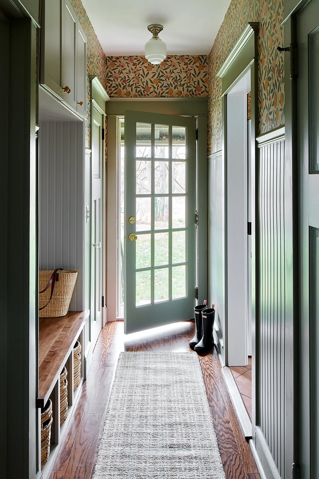
A hallway may seem like a transactional boring space that doesn't require much design, but we decided to really amp up the design here. This hallway was the spot where we could bring all the colors and textures in a big way to tie all the spaces together. The end result is a beautiful transition from the kitchen to a new laundry room, and out to the yard. We pulled all the greens, yellows, and terra cotta tones of the space through the hallway with a beautiful lemon wallpaper. Custom millwork accented in a tone of greens brings bold contrast and amplifies the height of the ceilings.
New cabinetry and a bench were built in the space that actually used to house the main refrigerator. The kitchen space was so small that the fridge was down the hall. Not only did we get the refrigerator into the main space, but we also created a space to take off shoes and store items easily. Adding a French door in the back beckons you to the yard and brings in so much light.
Laundry Room
The original hallway led to what used to be, a second smaller kitchen that was badly in need of an update. We repurposed the second kitchen into a new laundry room which also functions as an additional prep room with a beverage refrigerator and extra countertop space. The laundry room had been in the basement and it was a top priority to bring it up to the main floor.
The design builds on the color palette with soft green paint paired beautifully with warm terracotta tiles reminiscent of the original roof tiles on the house. We created a fresh new space with unique and simple details that add not only function but beautiful personality as well.
The final result is a fresh and modern, yet classic and refined space perfect for the 1920s colonial style home.
I hope you enjoyed it as much as we did!
If you’re interested in remodeling or designing your dream kitchen, Contact Us Here.
Or if you are curious about learning more about renovating, read up on our Five Steps to Successfully Renovating Your Home
Until next time!
Libby


